Sneak peek: details from our digital mural painting
See the entire wall at Cobra Museum of Modern Art during the Sowing&Weeding exhibition. Dates: 18.06 - 04.09 2011
The opening reception will be held this Friday 17h30 at Cobra Museum.


This entry was written by , posted on June 15, 2011 at 2:13 pm, filed under Uncategorized. Leave a comment or view the discussion at the permalink.
Ed Fella at Chaumont

An extrait of our little talk with Ed and Harmen.
P&V: How did you end up, starting from a commercial advertising agency designer to an autonomous graphic artist?
Ed: I just continued to be a graphic designer. I wanted to turn graphic design into an art practice instead of a commercial practice.
P&V: Were you combining your work with art before?
Ed: When you go out of high school you’re eighteen, than four years of bachelor, than in America you can go a two years of masters and phd if you want.. However, I went to a technical high school, it’s called trade school.
The ideology of my school was coming from from the Bauhaus. There was almost no difference between art and design
P&V: So you were fed with Bauhaus
Ed: Sort of yes. I had three years of art history. I had a pretty sophisticated education for a kid. It was les beaux art training like the time when you learn from drawing a model.
I was indoctrinated as a young person into this understanding of design and art as one. You were becoming either a fine artist or commercial artist.
What we were learning wasn’t called graphic design, it was called commercial art. The term ‘graphic design’ arrived in America in 60s.
Bauhaus called design as layout. In 50s when I started, I was called layout man. There were no layout woman. Women could not work more than eight consecutive hours, there were laws against it. However, in design practice we work more than eight hours, so woman could not be part of this profession.
Harmen Liemburg: Do you thing when the second world war ended, the whole movement liberated woman back to traditional role models?
Ed: Yes. The other thing was that people wanted to have the goodies, like washing machines, kitchenware, etc. So they actually had to work extra harder.
P&V: You mentioned that you were currently working with an exit strategy. Can you explain it further?
During thirty years, I worked as a commercial artist. I did what the client demanded.
However, all these flyers in the exhibition, I was the one bought them to the printing, that’s why it became art practice. I was the author of the command. It’s like buying your own print. I always lived in a modest way, that’s why iI did not needed to buy a lot of stuff. I only did enough money to live, no extra need.
The letterforms that I am currently working on, I call it art abbot commercial art, combining the whole little rich history of design with the vernacular, decorative forms, borders. America has such a rich history of typography. My work also discovers the American history, a vernacular history but still a professional one.
P&V: You have a great interest for the vernacular, can you explain what it means to you?
Ed: The vernacular is done with great care imagination and love. It’s done with the endeavor that people have.
It’s like the history of two masons, one is lying bricks, the other one is building a cathedral. The vernacular is about how people feel about what they are doing.
Human beings decorate themselves, it’s part of our evolution, we started with painting our caves. You can compare it to animals. For sexual attraction they grow beautiful hair.


This entry was written by , posted on May 30, 2011 at 4:37 pm, filed under Uncategorized. Leave a comment or view the discussion at the permalink.
Will Cotton & Katy Perry


It’s no coincidence artist Will Cotton created the painting for Katy Perry’s new album cover. It’s been a perfect storm of timing as Katy Perry’s latest video “California Gurls” reaches almost 23 million views on youtube and is the number one video in itunes. According to artinfo.com Katy Perry first heard about Will Cotton when a friend sent a link to his website. It wasn’t long before the two were collaborating on her new album cover; Cotton painted a nude Perry in a cotton candy cloud that also shows up in the video. Which by the way, art director for the video was Will Cotton. There you see Cotton’s brightly colored confectionary landscapes a la live action. It’s all a mix of perfect ingredients as “The artist explained how he had long admired Perry from afar, clipping images of her from magazines as a source of inspiration for his paintings.”
This entry was written by , posted on April 10, 2011 at 11:22 am, filed under Uncategorized. Leave a comment or view the discussion at the permalink.
Recently published
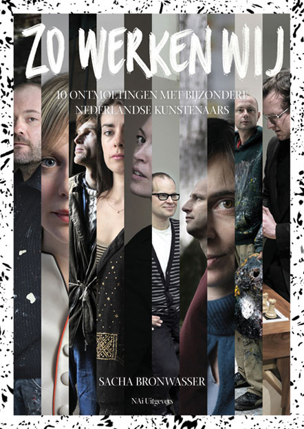
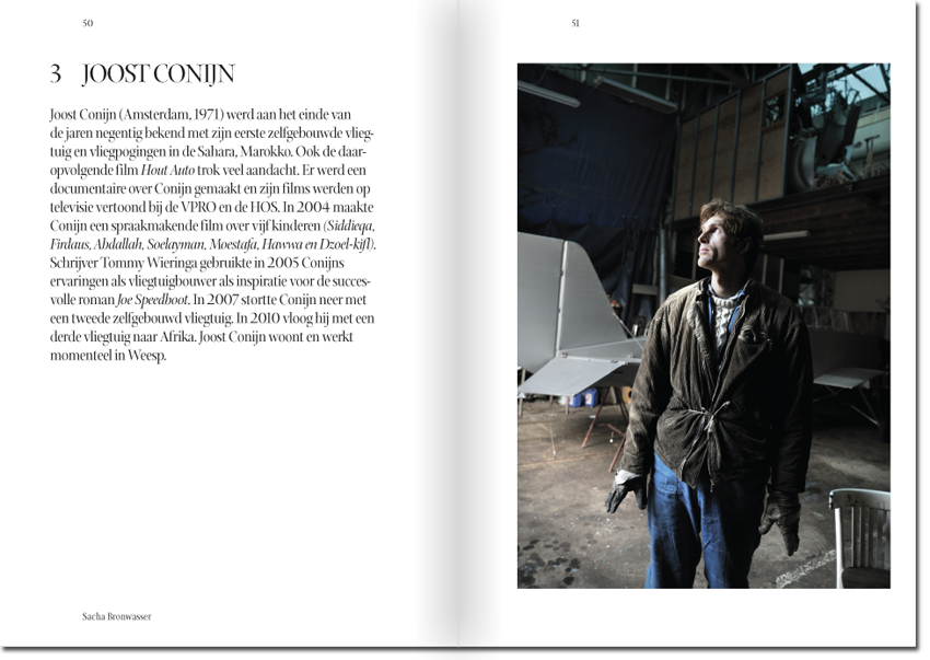
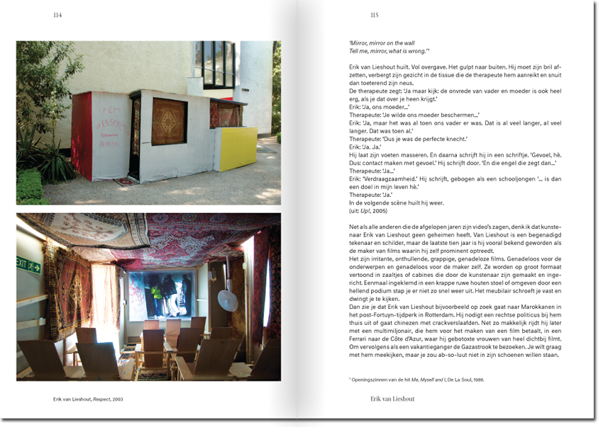
Publication design by Pinar&Viola for the book Zo Werken Wij, 10 ontmoetingen met bijzondere Nederlandse kunstenaars. Written by Sacha Bronwasser, edited by Barbera van Kooij, photographs by Joost van der Broek and published by NAI Uitgevers.
Art historian Sacha Bronwasser captured ten of the most prominent contemporary Dutch artists in their working atmosphere. She visited studios, workshops, museums, rehearsal rooms, galleries and studios. In these ten large portraits, she shows how these artists work and how a work of art is created. Ten artists talk candidly and in detail about their work, their background and practice of the artist.
For further reading in Dutch: Article on Metropolis M and NAi Uitgevers.
Order now
This entry was written by , posted on April 5, 2011 at 6:58 pm, filed under Uncategorized. Leave a comment or view the discussion at the permalink.
Other ecstatics: collage euphoria
Olaf Breuning is a Swiss-born artist, now living in New York.
Breuning squirreled away popular culture references that he would later effectively employ in his pieces. He cites as influence everything from sci-fi to horror via Vikings and haunted houses. His photographs, installations, and films feature a recurring vocabulary; face-painting, eyeballs attached to inanimate objects, long cheap wigs, naked breasts or direct movie allusions.
www.olafbreuning.com/


Enlightenment is an art collective from Tokyo, formed by Hiro Sugiyama, Shigeru Suzuki, Kaname Yamaguchi and Fumitaka Tanaka.
“Happy people can make good art. We express that positivism. The themes of artistic works don’t have to be problems”. In their collages, Enlightment is inspired by station kiosks, the streets and bookshops.
www.elm-art.com
search.japantimes.co.jp/cgi-bin/fl20100311jk.html


Seiko Kato:
Seiko Kato, originally from Japan, lives and works in Brighton, England.
She creates hyper detailed surrealistic collages while exploring life and death.
www.seikokato.com


This entry was written by , posted on August 10, 2010 at 10:56 am, filed under Graphic design, Other ecstatics, Uncategorized, Visual ecstasy. Leave a comment or view the discussion at the permalink.
» Next Entries