Diplo & Oliver Twizt GO music video sneak peek
We’re almost done with Diplo & Oliver Twizt hit single GO’s music video.
It will be online next week. Hold your breath!
A launch party in Amsterdam is currently getting planned. We’ll soon publish more about it.
Here are some screenshots from the video.


This entry was written by , posted on January 12, 2012 at 11:18 am, filed under Digitalization, Ecstatic Surface Design, Friends, Music, Pinar&Viola, Video, Visual ecstasy. Leave a comment or view the discussion at the permalink.
Racing whippets @ P&V HQ


Currently we’re tailoring the banging Go video for Diplo & Oliver Twizt. Click here to listen to the supersonic glowing song.
This entry was written by , posted on November 23, 2011 at 1:30 pm, filed under Ecstatic Surface Design, Music, Pinar&Viola, Video. Leave a comment or view the discussion at the permalink.
Cover design for Diplo & Olivier Twizt

Label: Mad Decent
The song is amazing!!!! It will be out 8 November. We’re currently making its music video.
This entry was written by , posted on October 18, 2011 at 10:15 am, filed under Ecstatic Surface Design, Graphic design, Music, Pinar&Viola, Published, Typography, Visual ecstasy. Leave a comment or view the discussion at the permalink.
Fatima Al Qadiri: Genre-Specific Xperience
And the best website award goes to Fatima Al Qadiri.
VISIT ALSO
Her DIS Magazine weekly attention-worthy music blog
Her Soundcloud


Genre-Specific Xperience
New Silent presents the launch of Fatima Al Qadiri’s new EP Genre-Specific Xperience. For this event Al Qadiri, a New York-based artist and musician, showcases five pieces of music that reinterpret five sub-genres of dance music: Juke, Hip hop, Dubstep, Electro-Tropicalia, and early-’90s Gregorian Trance. Each track will be accompanied by the premiere of a music video, created by some of the most exciting young artists working in video today: Ryan Trecartin, Rhett LaRue, Kamau Patton, Tabor Robak, Leilah Weinraub, and Sophia Al-Maria. An after-party that pays homage to the genres that inspired GSX follows. New Museum235 Bowery New York, NY 10002 212.219.1222

Album artwork by Daniel Keller and Timur Si-Qin
Born in Senegal, raised in Kuwait and now living in New York City, Fatima Al Qadiri is the producer and vocalist behind Ayshay. Fueled by her fascination with the sacred songs of Islam WARN-U is a homage and reinterpretation of the sounds that have haunted Al Qadiri since she was a child. Constructed entirely out of her own vocals, which she filtered and layered upon one another WARN-U is Al Qadiri’s attempt to reconfigure the concept of “sacred” music as inspiring divine love and divine fear. Even in her adoption of the name Ayshay, a flippant term which means “whatever” in Arabic, Fatima Al Qadiri seeks to distance the austere values inherent in worship music from her own interpretation of the latter.
This entry was written by , posted on September 30, 2011 at 12:40 pm, filed under Art, Exhibition, Internet, Music, Political glam, Video. Leave a comment or view the discussion at the permalink.
Album artwork for Anatopia


Album artwork design for Anatopia. The album will be released as a vinyl and in online music libraries. You can listen to their former album here. Album releasing party will be held on 23rd of September. We’ll soon post more information concerning the release and the vinyl.
This entry was written by , posted on August 31, 2011 at 12:46 pm, filed under Ecstatic Surface Design, Friends, Graphic design, Music, Pinar&Viola, Poster, Typography, Visual ecstasy. Leave a comment or view the discussion at the permalink.
GHE20 G0THIK


Ghe20 G0th1k
MIXTAPES
Ghe20 G0th1k is a social experiment in NYC turning into booty brawl. Voguing is a respected art here, and it’s not exclusive to the gays. While scene queens and party divas strut about, everyone is welcome to share the dark dance floor. Don’t expect to be coddled though: The patrons of this mostly queer party have absolutely no qualms about testing your abilities. Here, you earn your way to the middle of the dance floor through friendly dance-offs that prove you too can keep up with the fast-paced drums that provide the foundation for the club-meets-goth fete. When we walked in around 12:30 a.m., resident DJ Venus X was on the decks, dancing along to a quickly mixed set of Baltimore Club, R-Kelly (what? yes!), Bollywood remixes, and sissy bounce, akin to what Girl Talk would do if he had a taste for bass. “It’s a democratic approach to music that’s inherently queer,” Venus explains later. “It was initially dark wave and juke, and started to expand from there. We try to stay away from obvious American music and instead do a lot of black house, Middle Eastern music, stuff like that.” —> An extract of Puja Patel’s review on blogs.villagevoice.com
This entry was written by , posted on August 19, 2011 at 10:10 am, filed under Graphic design, Internet, Music, Other ecstatics, Poster, Typography. Leave a comment or view the discussion at the permalink.
Watch The Throne


Riccardo Tisci album art for Jay-Z and Kanye West’s ‘Watch The Throne’.
This entry was written by , posted on August 18, 2011 at 9:24 pm, filed under Music. Leave a comment or view the discussion at the permalink.
Maria Minerva - Lovecool
Maria Minerva - Lovecool from Not Not Fun on Vimeo.
New Feeling Industries drops us into a ’90s New Age virtual reality session in this clip for “Lovecool,” a soothing, airy new soundscape from Maria Minerva. Taken from Maria’s forthcoming new record Cabaret Cixous, out soon on Not Not Fun:
This entry was written by , posted on July 24, 2011 at 9:36 am, filed under Music, Video. Leave a comment or view the discussion at the permalink.
Gaga slime dress


The Dutch artist Bart Hess has designed a ‘slime dress’ for Lady Gaga from 15 pounds purple-orange slime. Lady Gaga asked Hess to make the dress following his work for American fashion magazine Vogue.
To find the right color and texture the artist mixed materials from the supermarket, do-it-yourself store and toy stores. Then he shipped the homemade slime from his studio in Eindhoven to New York.
The dress is shown in the booklet accompanying her CD Born This Way and his slime art is also featured in Gaga’s eponymous video clip. Photo: Nick Knight
This entry was written by , posted on July 9, 2011 at 9:39 am, filed under Art, Fashion, Music, Other ecstatics, Various. Leave a comment or view the discussion at the permalink.
Hatsune Miku, the hologram pop sensation

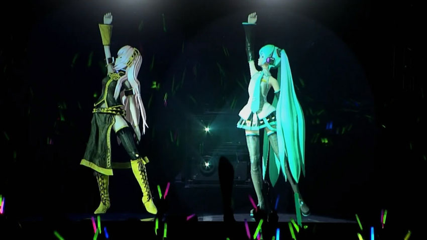
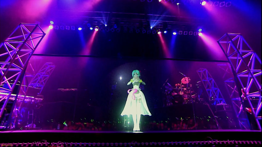
Hatsune Miku is the first and most popular installment in the Vocaloid Character Vocal Series, a singing synthesizer application produced by Yamaha.
Hatsune Miku’s original Japanese name (初音ミク) is somewhat a wordplay. Her name is made from the characters “未来” (Miku, Future), “初” (Hatsu, First), and “音” (Ne, Sound).
Beginning with her release in August 2007 Hatsune Miku has gained a lot of attention caused mainly by the Japanese video streaming site Nico Nico Douga.
This entry was written by , posted on July 6, 2011 at 11:06 pm, filed under Music, Various. Leave a comment or view the discussion at the permalink.
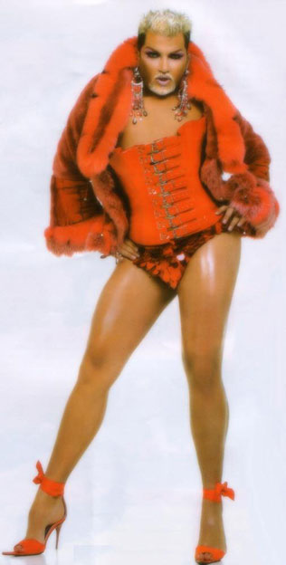
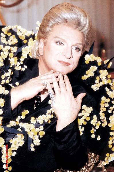
Azis & his role model Mr. Müren
Azis born Vasili Troyanov Boyanov Katsuras on 7 March 1978 is a Bulgarian Romani chalga (pop-folk) singer known for, among other things, his atypical gender expression and his flamboyant persona. He has takes Zeki Müren, a prominent Turkish singer, composer and actor (who was famous for his compelling voice and precise articulation in his singing of both established Turkish classical music and contemporary songs) as a role model.
This post is made possible by Ryan Weafer.


This entry was written by , posted on July 4, 2011 at 3:47 pm, filed under Music, Various. Leave a comment or view the discussion at the permalink.
Brilliantly disorientating
It’s the second time that we’re posting a video of Mr. West. The first one, after seeing Civilization in The Standard Hotel’s elevator in New York, he commissioned Marco Brambilla for his viode Power, and Tom Kan for the second one. The simiarity between the credits sequence of Gaspard Noé’s Enter the Void and the typographical sequences of Kanye West - All Of The Lights ft. Rihanna, Kid Cudi video is evident.
Please see the article A soul drifting in neon limbo of Rick Poynor on the treatment of words and typography in the contemporary feature films, and focuses on Wes Anderson and Gaspar Noé.
A soul drifting in neon limbo
By Rick Poynor
Published in Eye no. 78 vol. 20 (text in full)
Even in an era as typographically aware as our own it is rare to find feature film directors who treat words and typography as an integral component of their work. Jean-Luc Godard’s oeuvre, especially the classic films of the 1960s, remains the benchmark against which all typographic film-making must be measured.
Only two contemporary directors, Wes Anderson and Gaspar Noé, use words and type to reflect their cinematic vision with any consistency, though their style and aims could hardly be more different.
Hipster or not, Anderson has an old-fashioned, almost literary, taste for chapter-like breaks in his films’ narrative, and his typography, generally based on Futura, also works as a form of self-branding. This elegant, imaginary Anderson-world has undeniable flair and humour, though the self-reflexivity is too whimsical to pose much of challenge.
Noé’s use of the word as a filmic device is much closer to Godard’s: he wants to disrupt and disturb. In his first feature, Seul contre tous (I Stand Alone, 1998), an alarming tale about a butcher at the end of his tether, which unfolds as a scathing, non-stop monologue, he introduces sections with inter-titles in huge capitals – ‘Justice’, ‘Morality’, ‘Living is a selfish act’. A warning that viewers have 30 seconds to leave the screening, followed by the flashing word ‘Danger’, prefaces one particularly gruelling sequence. Noé might be toying with the audience but the frenzied hammer blows of the lettering add to the film’s unnerving harshness.
In terms of placement, Noé’s use of type in his latest film, Enter the Void, could seem more conventional: he confines it to the beginning and end. Even so the type plays the same vital role – see also Irréversible (2002) – as a means of expressing the film’s dark vision. Enter the Void’s titles can be viewed online (UK DVD release is scheduled for April 2011) but the best place to experience them is with the film, on a big screen in a cinema, as an overwhelming fusion of image and sound.
The sequence, directed by Noé with design by the Paris-based Japanese art director Tom Kan, is brilliantly disorientating. From the first frame, it is like being seized by an irresistible vortex of brain-scrambling sensation and sucked down into the film’s chemically modified consciousness. The type fills the entire screen and the editing is precision-welded to the stuttering beats of ‘Freak’, a 2003 track by the English techno band LFO. The credits flash by so fast that it is impossible to absorb them all, though a few names register in the visual noise.
As a piece of graphic design, the titles are both crude and sophisticated. This is an area of tacky popular graphics previously visited for its experimental potential by the late P. Scott Makela, The Designers Republic and Jonathan Barnbrook.
Kan exploits every trick in the commercial lettering manual: drop shadows, bevelled edges, Gothic type, neon type, 1960s futurism, shattered letters, melting letters. Spliced together with Japanese characters and subjected to jittery filters and treatments, this maelstrom of words signals the delirious, immersive excitement of Noé’s Tokyo, a city of nightclubs, logos, adverts, neon, throbbing music, drugs and sexual sleaze, a place where spiritual compasses can easily spin out of control.
Enter the Void’s psychedelic spectacle of a young man’s soul drifting after death has divided audiences. Some see it as a work of exhilarating technical innovation; some find it overblown and tedious. Some type enthusiasts complained that the film failed to live up to its stroboscopic titles. This response seems not only to misunderstand how titles can condense and reformat a film’s themes, turning narrative detail into graphic shorthand, but also to overlook Noé’s broader use of typography in his work as prompt, goad and pseudo-didactic audience-baiter.
After the title sequence comes the single word ‘Enter’. Enter the Void aspires to be a door of perception and we have been invited, or dared, to venture inside. Not until the end is the phrase completed, when it transpires that the whole film is clamped, like a big queasy burger laced with hallucinogens, between great slabs of type. The words are not, then, purely functional elements that could be cast aside without changing anything. The type is an intrinsic part of the void’s texture and meaning.
This entry was written by , posted on March 10, 2011 at 11:24 am, filed under Music, Other ecstatics, Typography, Video, Visual ecstasy. Leave a comment or view the discussion at the permalink.
» Next Entries